
Ticker tapes, also known as marquee text, seems to be making a comeback. I’ve seen it on numerous sites and have built that feature into 3 sites just in the past month alone.
I’ve played around with a few different ways to do this, including at one point, writing custom code on top of Flickity when I had to do it for a row of images. But ultimately, this simple CSS implementation has worked the best and been the most flexible – at least for my uses anyway.
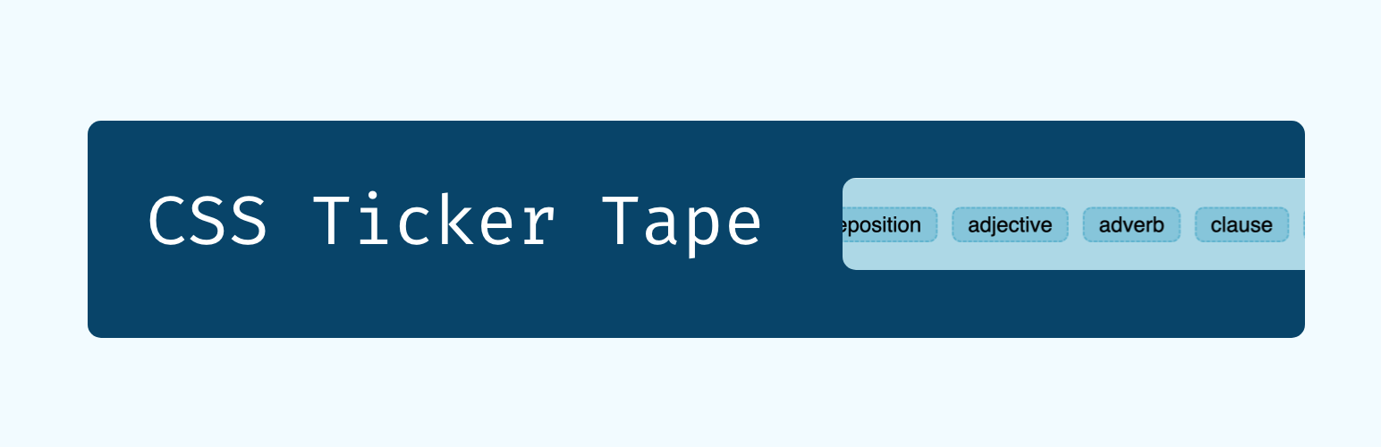
The marquee text element replacement we’re building
This is what we’re building. Yep, just a basic marquee text animation of the different parts of a sentence.
There’s of course, some simple styling to make it look presentable, but the part we’re going to focus on is the animation, structure, and settings we need in order to get that animation working well.
Find the complete code and link to a codepen version at the bottom.
Elements of the Ticker Tape
Here is the semantic HTML code we’re working with:
<div class="ticker-tape-container">
  <div class="ticker-tape">
    <span>object complements</span>
    <span>subject</span>
    <span>verb</span>
    <span>predicate</span>
    <span>preposition</span>
    <span>adjective</span>
    <span>adverb</span>
    <span>clause</span>
    <span>conjunction</span>
    <span>implicit object complement</span>
    <span>postposition</span>
  </div>
  <div class="ticker-tape" aria-hidden="true">
    <span>object complements</span>
    <span>subject</span>
    <span>verb</span>
    <span>predicate</span>
    <span>preposition</span>
    <span>adjective</span>
    <span>adverb</span>
    <span>clause</span>
    <span>conjunction</span>
    <span>implicit object complement</span>
    <span>postposition</span>
  </div>
</div>
There are 3 basic parts to the ticker tape:
- The ticker tape container
- The ticker tape (or marquee text) itself
- The objects (or children) we want to display in the ticker tape
The container for our marquee text animation
The container’s job is to contain the scrolling elements and be the flex container for the ticker tape itself, so the ticker-tape related CSS we want on our container is actually just two lines:
.ticker-tape-container {
    overflow-x: hidden;
    display: flex;
}
The ticker tape (or marquee text)
The ticker tape element itself is where our actual animation is going to live. Before we animate it though, we need to ensure the objects inside the ticker tape that we want to animate are lined up correctly:
.ticker-tape {
    display: flex;
    align-items: center;
    flex: 0 0 auto;
    gap: 1rem;
}
So we use flexbox to centre the items vertically and keep them in a row, with a 1rem gap between each element. We also use the flex property to ensure that this ticker tape element stays centred and sized appropriately, and doesn’t grow taller or wider because of any of its inner elements.
The custom keyframes animation
Now that we have our items in a row, they don’t overflow the container, we need to actually animate them. For that, we’ll use the animation element, and create a custom animation with @keyframes. In my case, I needed the ticker tape to animate and move towards the right, so I’m translating the element from 0 to negative 100% – backwards:
@keyframes marquee {
    0% {
        transform: translateX(0%);
    }
    100% {
        transform: translateX(-100%);
    }
}
If we wanted to animate the element moving towards the left, we would reverse the animation, starting from negative 100% and arriving at the initial position of zero at the end:
@keyframes marquee {
    0% {
        transform: translateX(-100%);
    }
    100% {
        transform: translateX(0);
    }
}
Setting up the animation
Now that we have our animation, we have to apply it to our .ticker-tape element. I’ve broken it up by each animation property so it’s easier to understand what we’re applying:
.ticker-tape {
    animation-name: marquee;
    animation-duration: 60s;
    animation-timing-function: linear;
    animation-delay: 0s;
    animation-iteration-count: infinite;
    animation-play-state: running;
    animation-direction: normal;
}- So we are applying the animation we created, called marquee.
- The duration is for 60s – you will want to play around with this, since it impacts the speed of the animation.
- The animation is linear – you can play around with this, but I found linear is the simplest and works the best for this kind of..for lack of better word, linear animation.
- There’s no delay, we want the animation to start as soon as the page loads.
- The iteration count is infinite, because we want the animation to be continuous.
- We want the animation state to be constantly running (this is a fun one, for example, you could have the animation play state pause on hover)
- We want the direction to be the regular left to right, but of course, you could change this.
Eliminating gaps and making it feel continuous
Now, if you examine the code of the example, you’ll notice that I actually have two ticker tape elements in there, with the same ticker tape objects. If you have only one, at some point you reach the end, and the animation waits till it’s essentially completely out of view, before starting again from the left.
To eliminate that problem, we stack two ticker tapes, so that when one ends, the next one is ready to go and fill the gap, until the animation for the first ticker tape restarts. As a rule of thumb, have two ticker tapes, but depending on your situation, you may need more.
It is a little bit repetitive, which is why for accessibility reasons, we add aria-hidden="true" to the second .ticker-tape element, to eliminate the repetition for assistive devices.
Ticker tape objects
Now we have the elements which will actually be animated. In the case of our example, these are just words wrapped in span elements, but you can have anything in here really. There’s not much to it, style them as you like, but the actual animation is handled by the elements higher up in the hierarchy.
The complete code
Here’s the complete CSS code to make the example exactly as it looks, and comes with CSS Properties to make it easy to control the different values of the animation as well:
.ticker-tape-container {
  overflow-x: hidden;
  max-width: 700px;
  width: 100%;
  display: flex;
}

.ticker-tape {
  --direction: normal;
  --duration: 60s;
  --delay: 0s;
  --iteration-count: infinite;
  display: flex;
  gap: 1rem;
  flex: 0 0 auto;
  margin-right: 1rem;
  min-width: 100%;
  align-items: center;
  animation: marquee var(--duration) linear var(--delay) var(--iteration-count);
  animation-play-state: var(--play);
  animation-delay: var(--delay);
  animation-direction: var(--direction);
}

@keyframes scrmarqueeoll {
  0% {
    transform: translateX(0%);
  }
  100% {
    transform: translateX(-100%);
  }
}

/* This is just some styling to make it look presentable */

.basic-styling {
  border-radius: 10px;
  background-color: lightblue;
  padding: 2rem;
  color: #010101;
  font-size: 1.5rem;
  font-family: sans-serif;
}

.basic-styling span {
  padding: 0.25rem 1rem;
  border-radius: 10px;
  border: 2px dashed #5fb3ce;
  background-color: #86c5da;
}
And here’s the HTML code again, for the sake of completeness along with the additional styling classes:
<div class="basic-styling ticker-tape-container">
  <div class="ticker-tape">
    <span>object complements</span>
    <span>subject</span>
    <span>verb</span>
    <span>predicate</span>
    <span>preposition</span>
    <span>adjective</span>
    <span>adverb</span>
    <span>clause</span>
    <span>conjunction</span>
    <span>implicit object complement</span>
    <span>postposition</span>
  </div>
  <div class="ticker-tape" aria-hidden="true">
    <span>object complements</span>
    <span>subject</span>
    <span>verb</span>
    <span>predicate</span>
    <span>preposition</span>
    <span>adjective</span>
    <span>adverb</span>
    <span>clause</span>
    <span>conjunction</span>
    <span>implicit object complement</span>
    <span>postposition</span>
  </div>
</div>
And if you want, you can play around with this example in CodePen.
If you liked this article, you’ll enjoy my biweekly newsletter on modern development.
Get an original essay or tutorial in your inbox every other Tuesday.