
Published
Last modified
This is a note. Notes are work-in-progress thoughts and ponderings that I choose to share “out loud”, subject to change and revision.
I often get asked about accessibility when it comes to design and development – particularly in the WordPress space. While I’m no expert – rather I seek to learn from people who know far more than I do in this field (think Amber Hinds, Alex Stine, Sara Soueidan, Heydon Pickering), I do have a handful of suggestions I often share with people.
I was recently asked again, so I thought I’d start up a little note to gather and share those resources and tidbits.
But first, let’s start with a reframing:
Accessibility should be one of the cornerstones of your approach
The very first thing I want to note is that if you think of accessibility [features] as something you add to a project after the fact or near the end, you’ve already handed yourself and your team the short end of the stick.
You start with accessibility, your mindset, your approach, the way you think about your content, user experience, design, development – everything. Making your digital work accessible is as important (if not more important) as making it aesthetic.
And yes, it’s a fallacy that accessible inclusive design can’t look good or be beautiful.
While you can adjust a project for better accessibility after the fact, nothing will be quite as great as the project that incorporated inclusive accessible methodologies from the beginning.
Progress is better than no progress
I get it – there are a lot of passionate and fierce people out there (present company included), and sometimes it can be scary to make any changes because someone out there is going to say it’s not good enough. I see it happen time and time again.
Well – no one is perfect, no website is perfect. Make your work as accessible as you know how, learn from the folks who provide feedback, and keep improving.
Don’t worry about the people who seem to be haters (or are). You’re not doing this for them.
Here’s a (slightly different) way to think about it that might be helpful: You’re doing this because you believe that the work you create is awesome and it deserves to be usable and accessible to everyone who uses the web.
Yes, I’ve framed that previous statement as being about your work and not about the audience you serve, on purpose.
Accessibility is important for everyone
Often when people think about accessibility, they think about folks who use a screen reader, they’re thinking of the permanently blind or ones with permanent hearing loss. However, disability is not always permanent, it can be temporary and it can affect anyone. In fact, let’s reframe this, I love this quote from Cindy Li that Jim Nielsen reiterates, “We’re all just temporarily abled.”
I have no visual or auditory impairments, but I keep subtitles on for 99% of the media I consume if it’s available. It enhances my experience and lets me consume videos (for example) even if I can’t have the sound on, it lets me get the gist of a podcast before I commit to listening, etc.
Or think of the parent holding their kid with one hand, needing to do something on their phone quickly.
Or the writer who forgot to plug their trackpad in and now it’s dead and they only have a keyboard to navigate around with on their computer.
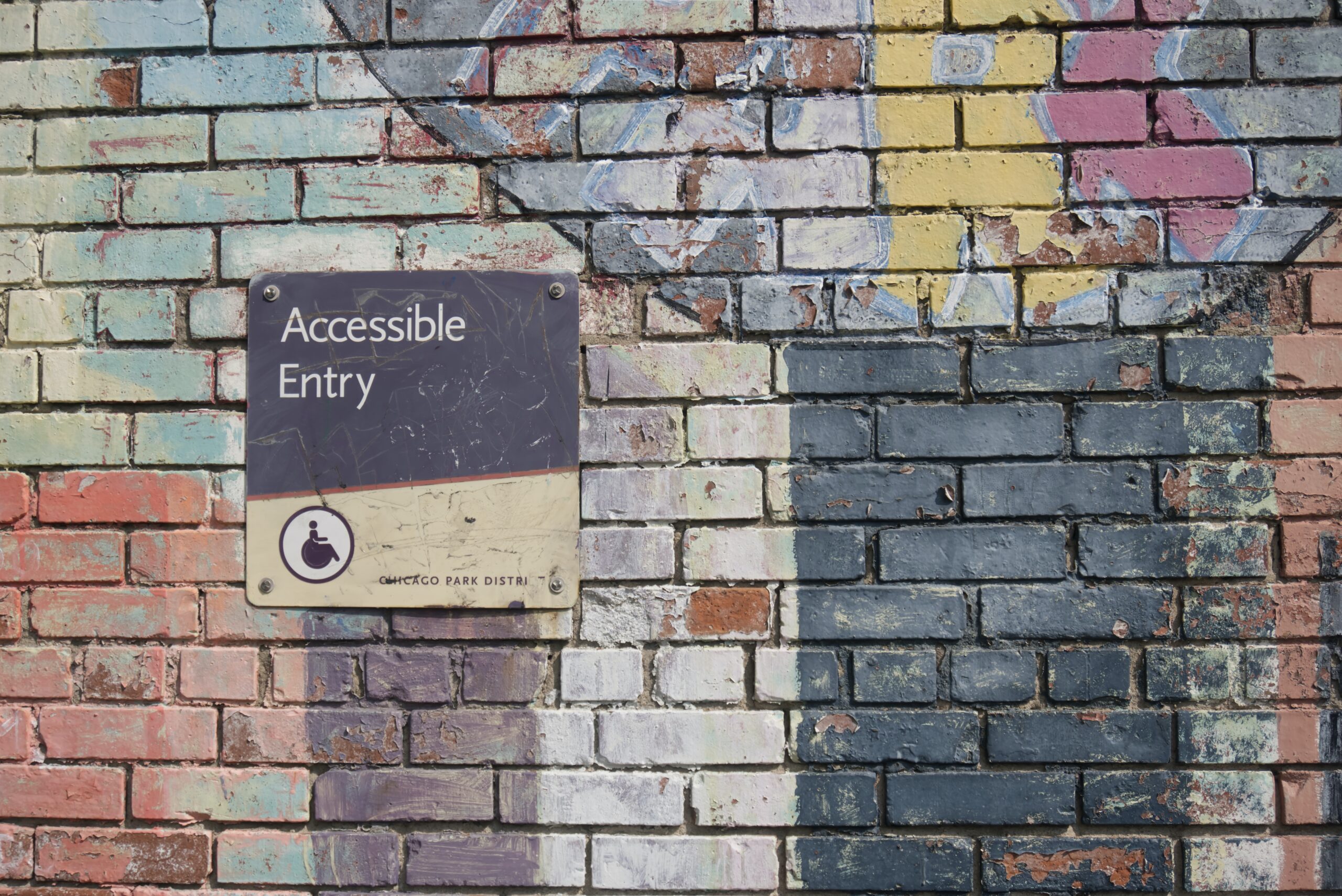
Just like adding curb cuts to sidewalk corners didn’t just help people with wheelchairs (it helped the family with strollers, the movers with big boxes on a trolley, etc), creating accessibly improves the experience for everyone. It’s a rising tide that lifts all boats, as the saying goes.
Accessibility can be loosely organized into the following categories:
- Content Accessibility
- Design Accessibility
- User Experience Accessibility
- Technical Accessibility
There are lots of other facets to accessibility, and you can get pretty granular with the categorization, but those are the 4 perspectives you generally want to tackle accessibility from in any project.
Content Accessibility
Before you can even think about design or technical aspects of accessibility, you have to consider the actual content you are designing or developing for. If the content itself isn’t accessible, then your design and technical accessibility can help but can’t fix the fundamental problems.
Accessible content is clear, hierarchical, and considers the comprehension levels of its target audience.
I often refer to this guide from Mailchimp on content accessibility:
A couple rules of thumb to keep in mind:
- Your content should make sense even if someone can’t see the layout or design of the page.
- Make sure your headings make sense. After a Heading 2, you shouldn’t be jumping to a Heading 4, it should be Heading 3.
Content Accessibility also includes inclusivity
While this not a primer on the more nuanced aspects of good writing, I do want to take a moment and point out that accessibility is not just about whether someone can access your content. In a lot of ways, it’s also about whether the right people can connect with your content, which is better described as inclusiveness.
This is a guide on inclusive writing from the Government of Canada, which I have bookmarked and find myself studying a lot when I’m thinking about content on a large scale.


Design Accessibility
I don’t know why it is, but in my personal experience finding [web] designers who think and create accessibly has always been a challenge. That is hopefully starting to change, because the design informs the accessibility of a website quite heavily.
Some things that are top of mind as I think about design accessibility right now:
Colour contrast
You want to ensure there’s a good amount of contrast between the background and foreground of any element that people should be able to identify. And note that I said identify, not read.
An example of a situation I, myself, have often had to grapple with, is when the background colour of a button doesn’t have enough contrast against the background it sits on. Sometimes this is okay and sometimes it’s not. It’s a bit contextual and really depends on what else separates a button from something else. Which of course brings us to the second point:
Colour shouldn’t be the only way you indicate an important context
The easiest example of this is that if you have an error message, it shouldn’t be denoted as an error simply because it’s red. There should be something else that helps provide that error-related context, such as an icon or even the word, “Error” itself.
Typography and sizing should be as flexible as you can reasonably make it
Thinking responsively and allowing for different text sizes on different devices is something we’re all pretty used to incorporating into our work. But something that I’ve started to think about more recently is the flexibility of that sizing.
This recently came up as a very hot topic in a project I was on, where one of the key internal stakeholders in the client team permanently keeps text sizes at 125% on their iPhone. Which also led me to think about how my own parents typically have the font sizes on their phones increased by at least 10% or so.
So it’s worth testing and considering how much magnification your design can take – especially on a small screen. How much can a person magnify the page on a small screen before it becomes an untenable experience. Right now, my thought is that you should be able to magnify to at least 125% without it becoming a problem.
And here are a couple points I often harp on a lot when I work with designers:
Please include both hover and focus styles in your style guide.
 Developing a focus style for a themable design system – Ad HocAd Hoc brings small teams of skilled professionals together to build government digital services that are fast, efficient, and usable by everyone.
Ensure that the heading styles you create are indicated for every heading level.
I cannot count the number of times I’ve seen content creators choose an arbitrary and incorrect heading level because they felt that the style of that heading visually lent itself better to the context of the content. Let’s just do away with that and provide more flexible and variable styling for aesthetic-heavy design systems, yeah?
User Experience (UX) Accessibility
User Experience Accessibility is one of those blurry areas that is a solid combination of both design and technical, but laser focussed on how someone navigates the interactive parts of a website or page (or app). While it’s informed by visual design, its main focus is not aesthetics, and while its informed by good technical accessibility, its main focus is not semantic code, although both those things can and do help.
There’s a nice little handbook from the United States Federal Government that provides a solid overview of UX accessibility and links out to helpful links as well:

Some general things I like to keep in mind when considering UX accessibility:
- Is there a “Skip to Content” link as the first interactive item on the page?
- Can you navigate this with just a keyboard?
- Is this experience usable without colour?
- Can I easily identify what I’m focussing on?
Technical Accessibility
As a developer and someone who often serves as a technical strategist on projects, I think a lot about all the aspects of accessibility, but of course, technical accessibility was where I first started when I began to intentionally code more inclusively.
The very first resource I’ll share is of course the Accessibility section in the WordPress Coding Standards handbook:
It has solid advice and a plethora of links you can dive into as you’re ready.
Some general things we want to keep in mind though:
- Is my code semantically correct? No using divs to create buttons please.
- Does the tabbing order of elements make sense?
- Where appropriate (because semantic code isn’t enough), have I incorporated ARIA tags?
- Does the page load fast enough?
- Have we avoided content shifts as things load, to avoid things jumping around?
- Can the text be resized?
- Does this look the same on all browsers?
- What does this look like in “Reader” mode that many browsers (particularly Safari) provide?
A note on tooltips
Turns out aria-label is considered more important for assistive devices than title, however, for sighted users, we often use title to provide a native tooltip – but some assistive devices won’t read the title no matter what, so you may end up in a situation where you want to add aria-label and title to the element. However, what happens for the assistive devices who read out both attributes? For them, you’ve now created extra redundancy that is unhelpful.
So currently my thinking is that, this is one of those situations where a JavaScript solution is better than a native browser attribute because of how differently it’s treated by the user agent. A helpful ARIA conforming library for a tooltip that the WordPress Block Editor uses is this one:

Credit to Alex Stine for helping me understand more of the nuance of how different user agents treat aria-label and title.
General Accessibility Resources
This is a fantastic general resource with lots of linkbacks to other helpful articles. It covers design, content, experience, etc.
This is a helpful and easy to consume guide that can help you meet WCAG standards.
The ARIA authoring guide is amazing. It has lots of helpful design patterns and easy to consume explanations that can help both designers and developers ensure they are approaching common patterns and use cases correctly.
WordPress Accessibility Resources
The Accessibility Handbook from WordPress contributors is also an excellent starting place with tons of best practices and guides.
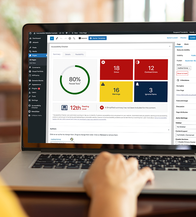
The Accessibility Checker from Equalize Digital is fantastic – it has a free version to get you started.

WPAudit is a helpful checklist you can use when you launch any website and it has a handy Accessibility section as well. Made by yours truly. 🙂

If you liked this article, you’ll enjoy my biweekly newsletter on modern development.
Get an original essay or tutorial in your inbox every other Tuesday.