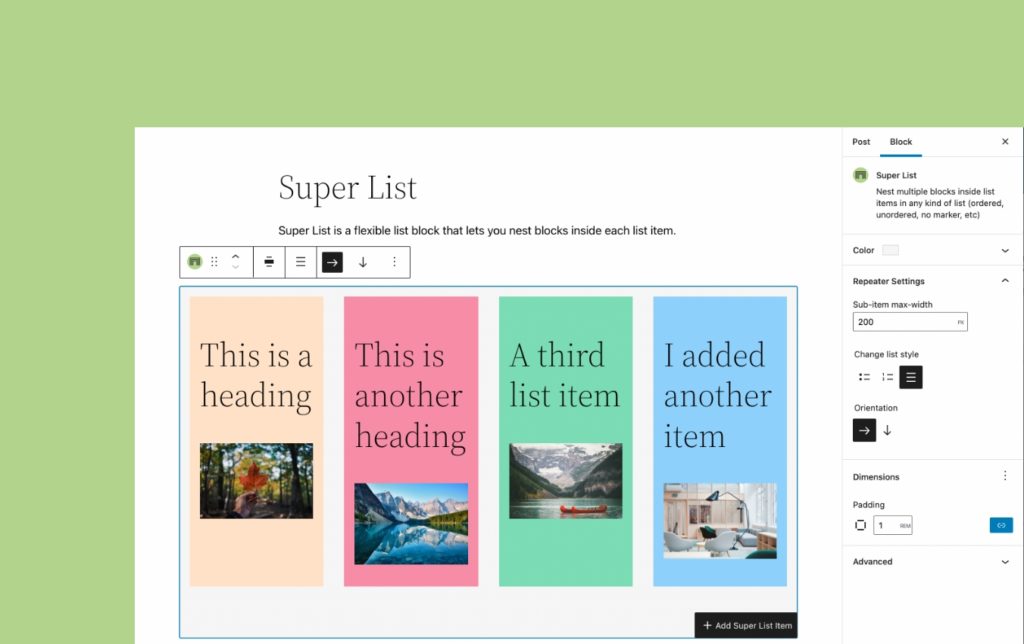
Last week, while scrolling on Twitter, I came up with the idea of the Super List Block, a simple list block that lets you nest more blocks inside each list item, much the way the Cover Block or the Columns block does, but in a semantically correct list.

This simple little block makes lists into containers, rather than just allowing simple text only. Add whatever you want, an image, headings, another whole list, etc.
But Aurooba, we can basically already do this with multiple Group Blocks
What this block does is provide semantically correct code making it a proper list – unordered or ordered. It also means you can just click the appender to add another list item instead of having to add another group block, which is an extra couple actions/clicks.
With this block, your listicles are semantically correct and more accessible. It’s also conceptually easier to understand for folks coming from page builders or ACF-built websites. Instead of brand new blocks, you just add a new row and do what you want.
Some interesting features of the block
The list below is created with the Super List block!
Grid Mode

With this block, you can not only create multimedia rich lists, you can also create a flexible responsive grid. The block has the option to change the flow of content from vertical to horizontal, letting you create a grid of items that flows seamlessly onto the next row when the first fills up.
Responsive Item Size Control

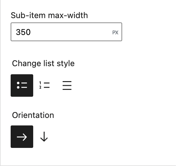
When you are in horizontal/grid mode, you can also choose how big each cell or list item can get, giving you easy control over how the grid flows, without any extra code.
Baked in Color and Spacing controls
The block comes with baked in support for colours – change the background colour or text colour of the whole block or individual list items.
You can also take advantage of the new spacing controls in 5.9 – add padding and margin easily without extra classes or code.
No Marker Mode
Sometimes you want a semantically correct and accessible list, but you don’t want to show the bullets. The block comes with the option to turn off the bullets, and still have the list-items be semantically correct.
Exploring improvements and enhancements
As you play with the block, you’ll find a few tiny little enhancements to the nested block experience I’m experimenting with. There is:
- The ability to jump back to the parent block settings from the list item block
- A far more visible and clearer block appender inside the Super List Block to help differentiate it from the regular block inserter button for the root document.
- The ability to add another list item from the current list item’s toolbar
I have a slew of other ideas on how to improve and enhance this block, and I may just make a premium version of it at some point too. I can see a lot of potential for using this block in various ways in my client work. This is my first publicly available block and I’m pretty excited about improving it and seeing how other people use it.
Lots of thanks for all the folks on Twitter who took the block for a spin, offered feedback, and encouragement! This block went from idea to reality in under 9 days, working in little snatches of time between all my other projects.
Hopefully coming to the Block Library Search soon
Right now, there is a weird issue that causes the block to temporarily error out when installed from the Block Library. I’ve investigated issue to the best of my ability and for now, I’m not sure the problem is in the block, rather I think there is something odd going on when blocks with parent/child relationships are installed from the Block Library Search. Hopefully, I can get to the bottom of this with the help of folks who work on the Block Library Search, and then I can make it available there.
In the meantime, you can download the block from the .org repository. 🙂
If you try out the block, I’d love to hear what you think. 🙂
Thanks for reading!


